Goals
At the outset of this project, my objective was to characterize the coverage of India in the New York Times. Specifically, has there been a change over time in the amount of coverage that the New York Times has devoted to India? In addition to quantifying the frequency of topics, which keywords appear together most often?
The analysis here only reflects data up to and including 2020.
Before Browsing
The ability to answer big questions like these depends heavily on the extent to which the data can serve as a reliable summary for 160 years of reporting.
Before drawing any conclusions from the visualizations, it is important to recognize that certain qualities about the data returned from the API, at the very least, complicate long-term comparisons. Although data is available as far back as 1860, the nature of data returned from the API over time includes significant changes.
Changes to Keyword Tagging
Although the API documentation allows queries back as far as 1851, the earliest result with an India location keyword was 1860. Based on this point alone, it seems unwise to conclude with certainty that the New York Times published zero articles about India in the 1850s, which included momentous events like the Sepoy Mutiny of 1857.
Even adjusting the API query from an India location keyword to a simpler India query string failed to return more results during this time period.
The dedication to keyword tagging has clearly increased over time. In 1860, an average article had just 2 keywords. In 2020, the average article had 9.2 keywords.
This massive change in keyword tagging practice must condition the conclusions one draws based on keyword data over long periods of time.
For example, as shown in the Counts tab, Narendra Modi is the most frequent person keyword in the whole dataset. However, it would be unfair to conclude, based on this evidence, that he is the most-discussed person in the history of the NYT’s coverage of India. If you browse the early articles, it is not unusual to find articles referring to Mahatma Gandhi in the headline, but without including him as a keyword.
Changes to News Desk, Section, and Material Values
The level of specificity in categorizing an article also improves over time. Recent articles have descriptive categories for news_desk (such as Foreign, Editorial, or Travel), section (such as World, Opinion, or Arts), and material (such as News, Letter, or Obituary). However,
- Before 1981, the only news_desk value is “None”.
- Before 1981, the only section value is “Archives”.
- Before 1964, the only material value is “Archives”.
Accordingly, applying a filter of “Foreign” news_desk removes any article before 1981. Using a combination of the Counts, Timeline, and Table tabs allows one to sense-check the applied filters.
Changes to Text Values
For the most part, the API does not return the text of the original articles. It returns metadata that can help characterize an article.
Three columns though – headline, abstract, and lead_paragraph – do provide natural language data. For these columns, it is important to recognize that the style or format of newspapers has changed over such a long period of time. Depending on the year, headline, abstract, and lead_paragraph can return very different results.
If you browse the early articles, you’ll note how it is very common to find articles with headlines that are either the length of a paragraph or just 2-3 words. The current headline convention only dates to about 1965.
For some periods of time, it is standard practice to find both an abstract and a lead paragraph. In other periods, an article may only have an abstract, or nothing at all.
The contents of the abstract and lead_paragraph change wildly over time.
- Before 1964, almost no articles have lead_paragraph data.
- The abstract in articles before 1965 might just be a few words. It then peaks around 1985 before settling near its current value since 2007.
- In some cases, abstract and lead_paragraph are near duplicates of each other.
Accordingly, like with keyword data, one should be cautious about making comparisons using word frequency data over long periods of time.
Understanding Article Counts
One might be tempted to draw conclusions about the importance of a topic based on the number of articles published over time. Before making such conclusions however, one should understand what is included (and what is excluded) from the data set.
For example, should blogs be treated the same as front page news? You can use the filters to adjust these settings as needed.
- About 8.05% of the data are not printed (e.g. blogs).
- About 8.44% of the data are front page articles.
To give another example, letters to the editor are treated as separate “articles” since they have unique URLs. Accordingly, five different letters to the editor (each only an opinion a paragraph long) may appear as five articles on the same day with the same title.
Timeline Analysis
Can we identify trends in the quantity of coverage that the New York Times has devoted to India?
A first glance at the Timeline tab suggests the peak of India coverage came around 2012-2014. However, the shift to (and later shift away from) blogging complicates this understanding. The NYT India Ink blog ran from September 2011 to June 2014.
This was a period of intense coverage – 1,681 posts over 1,023 days. There are important reasons why the NYT devoted these resources to India during this time period. The lead up to the 2014 general elections (which elected a majority BJP government for the first time in history) is certainly one key story line.
For long term comparisons, however, digital-only content is somewhat of an apples-to-oranges comparison to printed news.
After removing blogs from the trend of printed news, the picture is very different. 2012-2014 no longer stands out as exceptional. Of course, if the India Ink blog was not running, perhaps more print articles would have been published during this same time period.
The closest apples-to-apples comparison is to restrict the pool of articles to front page news. In addition, the front page news category above excludes articles that include “World Business Briefing” in the headline, which was a short roundup of business stories from around the world that commonly landed on the front page during some years – but not exactly big India stories.
When this is done, the top years include:
- 1962: The Sino-Indian War;
- 2004: General elections return a Congress government after the first period of BJP rule;
- 2002: Standoff between India and Pakistan in Kashmir (The communal violence in Gujarat was not front page news);
- 1930: A major year in Gandhi’s civil disobedience movement, including the Salt March;
- 1965: War between India and Pakistan.
Other years with even more momentous events (e.g. 1947) have actually far fewer front page articles.
Map Analysis
The main conclusion to draw from plotting all location keywords on a map is not a surprising one. Pakistan and Kashmir have been the overwhelming focus of the NYT’s coverage of India.
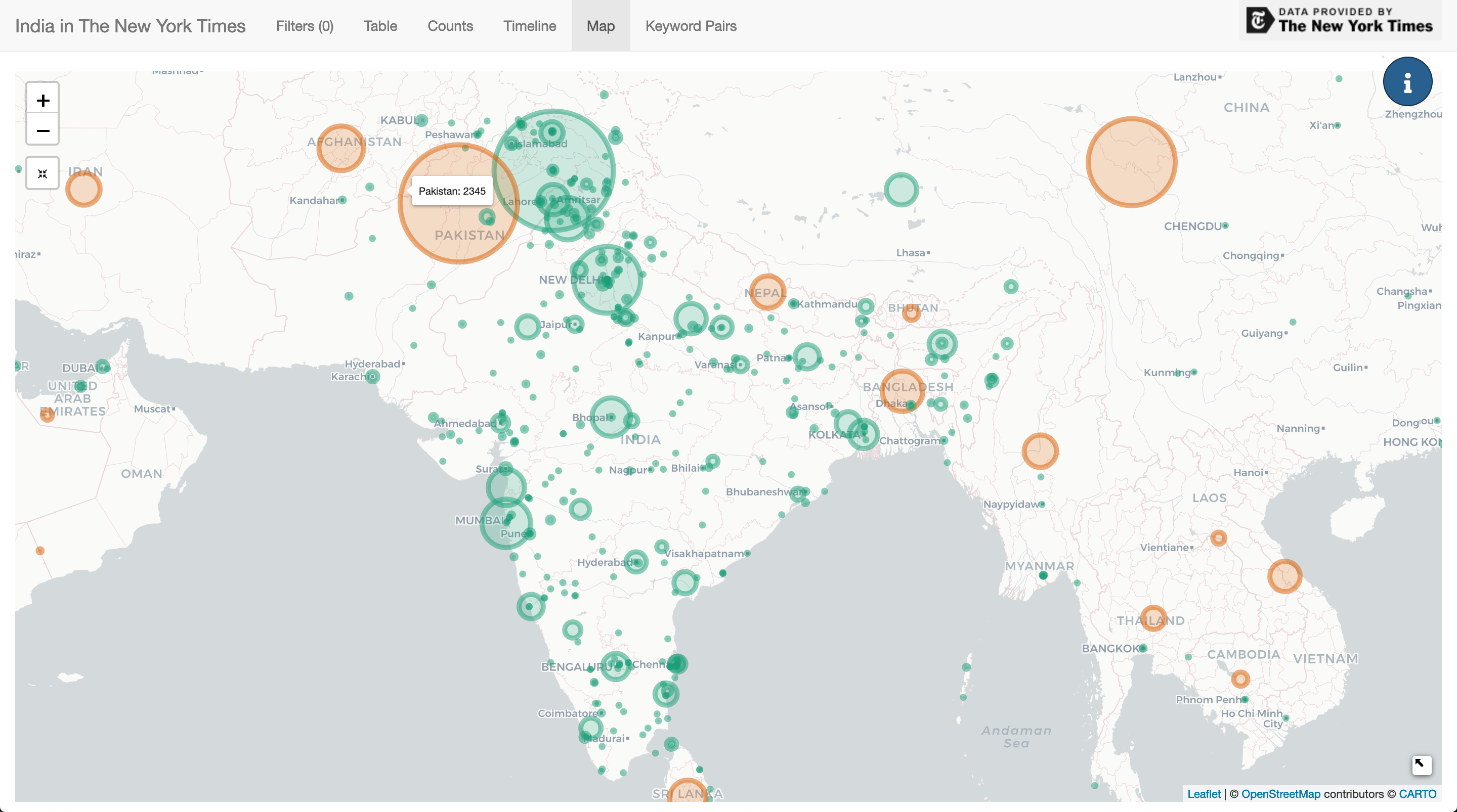
The same point can be ascertained more clearly from the Counts tab.
When creating the map, I scaled the bubbles with a square root function to overcome the vast disparity between the counts of the top locations like Pakistan compared locations that might only appear once.
There’s not too much to be that needs to be said about the map. I chose the Mapquest API for geocoding without a lot of research. There’s definitely a fair amount of errors, and so perhaps in future I’ll try another geocoder.
One interesting use case for the map is to find a rare location, click to filter, and then check the table for articles. For example, filtering for Jodhpur returns just one article from 1926.
TOY RAILROAD FOR A RAJAH.; Line In Jodhpur, Half a Mile Long, Will Cost $17,500.
Keyword Analysis
Among all of the data returned from the API, keywords are perhaps the most interesting. Every article contains a list of keywords categorized by type and ranked by importance. Once cleaned, and changes in tagging practices over time are understood, it’s a very rich source of data.
Keyword Timeline Analysis
The initial bar chart found in the Counts tab when plotting all keywords is not particularly captivating. The ubiquitous keyword “politics and government” dwarfs other topics.
Just a little digging though can reveal some interesting insights. For example, filtering for only articles that include a “kashmir and jammu (india)” keyword reveals a dramatic spikes in coverage, mirroring conflicts in the region.
Converting keyword counts to a percentage is also a good gauge of what topics have commanded the most attention at a particular period of time.
Taking just the last 20 years, one can see how a few select keywords have risen or fallen out of the story. For example, one can see the steep rise of attention towards Narendra Modi beginning after 2010.
Keyword Network Analysis
Keyword counts (and counts converted to percentages) show general trends among topics. However, the structure of keyword data can allows it to be visualized as a network. Thinking this way can reveal which keywords tend to appear with other keywords.
Creating a network analysis graph for this data that is not an uninterpretable hairball might be a future challenge. A heatmap though that quantifies the relationship between two keywords is a good start.
The Keyword Pairs tab takes a moment to comprehend. To take an easy example, when viewing all articles, the heatmap shows that 55.3% of articles with the keyword ‘elections’ also have the keyword ‘politics and government’. We know that “politics and government” is the most common keyword overall (found in 19% of all articles) so this is not too surprising. Similarly, articles with the keyword “united states international relations” also often have the keyword “pakistan”.